Take a look at some of Perception LLC’s recent design work. Have a project of your own you’d like to get started on? Get in touch today!


Perception LLC added a new photo — with Steiner Electric, Inc.
Steiner Electric, Inc. recently remodeled their space, adding valuable administrative areas as well as creating a more efficient multi-purpose warehouse for hosting trainings and apprenticeship classes. Wanting to keep their mission highly visible, they tasked Perception LLC with designing large boards to help keep their values and strategic plans front and center throughout the office. Great print job by Foerster Signs as well.
Perception LLC added a new photo — with Big Brothers Big Sisters of Washington County, WI.
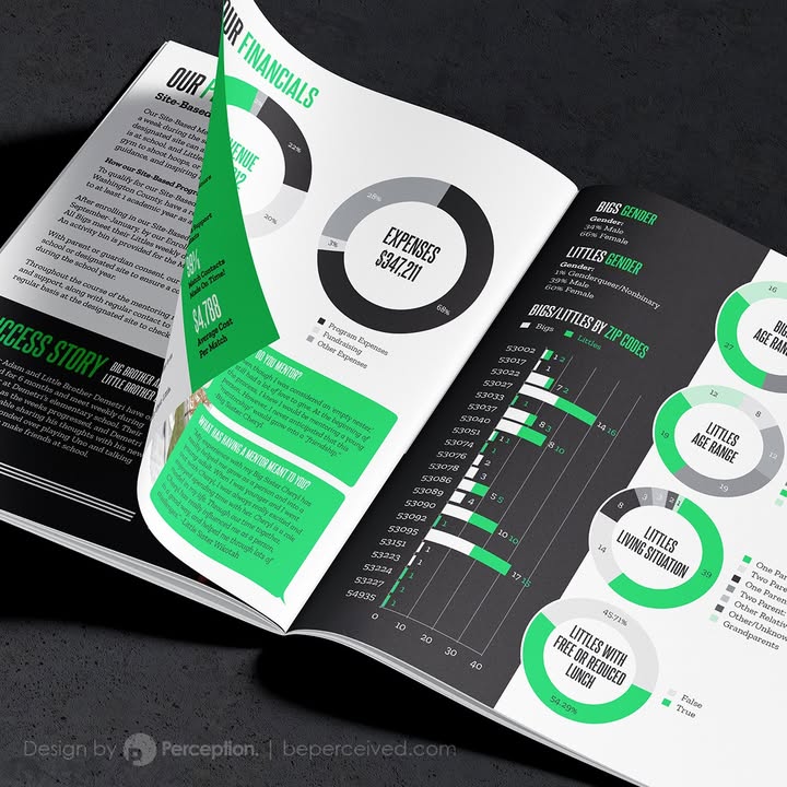
The Annual Report for Big Brothers Big Sisters of Washington County greatly benefited from breaking down extensive data and refining its presentation into approachable and easily understood graphics.
Perception LLC added a new photo.
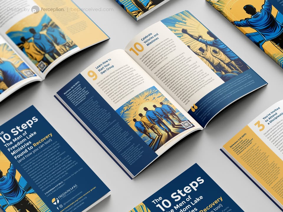
Perception LLC is proud to have worked with Freedom Lake Ministries to design their 10 step guide to help support individuals on their road to recovery from addiction. At Freedom Lake Ministries, men have found life-changing freedom beyond recovery through Christ-centered discipleship.

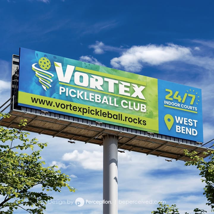
Perception LLC is with Vortex Pickleball Club.
Did you know Vortex Pickleball Club hosts cornhole tournaments? There's no better place to toss some bags in the cold of winter. Check out this custom branded set Perception LLC designed.
Have a project you want to bring to life? Get in touch today.
Perception LLC added a new photo — with Big Brothers Big Sisters of Washington County, WI.
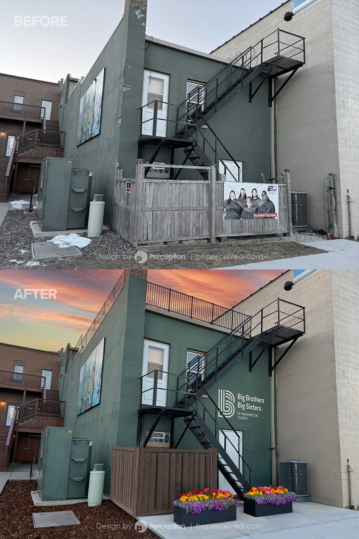
Big Brothers Big Sisters of Washington County came to Perception LLC requesting help to better visualize their ideas for potential exterior building upgrades, which included repairing plaster, adding a railing to the rooftop, updating a privacy fence, pouring a new concrete patio with two large planters, and adding their logo to the rear of the building. Perception LLC was happy to provide this rendering at no cost to this great organization to help fulfill their vision and improve their presence along the West Bend River Walk.
Perception LLC added a new photo.
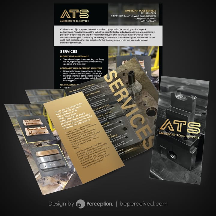
As go-to experts for tool and die repairs, American Tool Service LLC restores and optimizes equipment for peak performance, ensuring minimal downtime and maximum efficiency. To better promote their business and highlight their services, ATS trusted Perception LLC to redesign their existing sell sheet and to design a complimentary tri-fold brochure.
Perception LLC added 3 new photos.
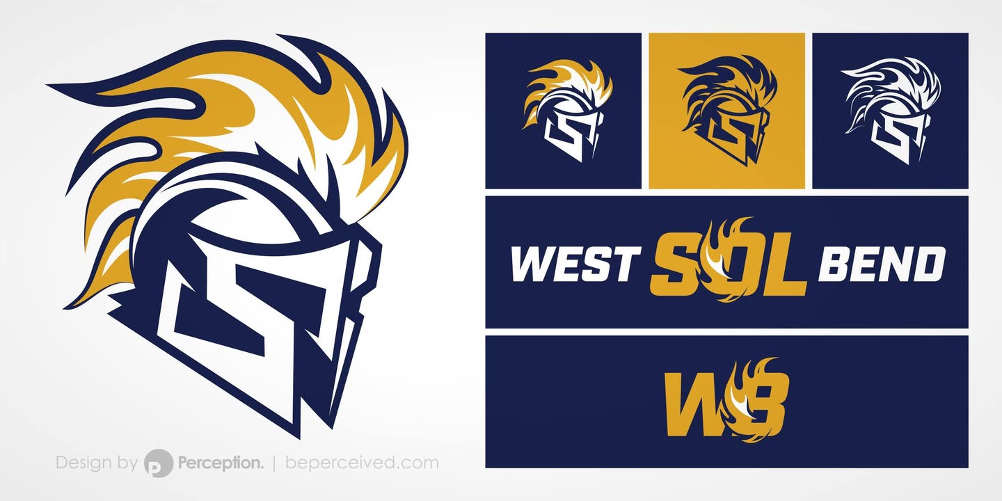
For those familiar with Southeast Wisconsin, West Bend is often recognized as the city with “two high schools in one building.” For residents, this distinctive arrangement has long been a defining and cherished aspect of the community. West Bend East and West Bend West have cultivated one of the region’s most enduring and spirited high school rivalries. As a purely hypothetical and fun conceptual design exercise, I wanted to explore the possibilities of uniting two distinct brands into one by focusing on unifying the two schools while honoring their rich and storied histories. This work is not affiliated with or endorsed by the school district, the City of West Bend, or any other organization. It is intended solely as a creative exploration of identity and design. The first—and perhaps most critical—step in this process is selecting a name. At first glance, “Badgers” presents itself as a safe and familiar choice, carrying historical significance as the original name of West Bend’s early athletic teams. Yet the opportunity exists to think more deeply and consider alternatives that symbolically reflect the union of East and West. One such option is West Bend Meridians, a name that represents the idea of convergence—quite literally, “where East meets West.” Another possibility is West Bend Zeniths, referencing the highest point or peak of achievement. In astronomy, the zenith is the point directly overhead, precisely centered between the eastern and western horizons, making it a compelling metaphor for unity and excellence. A third option is West Bend Sol,

Perception LLC added a new photo.
Logo design and business card for Prust Legal. As the most important element of the design, "Prust" is bold and contrasts with a lighter weight for "Legal." The two words are the same width to provide balance to the overall design while an abstract courthouse with 3 simple columns and a roof (formed by the"ru" in "Prust") provides a feeling of strength and stability.
The trickiest part of this design was getting the "shoulder" of the "r" just right. Too thick and it becomes distracting as a horizontal element, with the left-most column suffering as a result. Too thin and the "r" loses legibility. The solution is the result of finding the optimal thickness combined with the small notch at the terminal where the "r" meets the "u." The resulting form is balanced as the shoulder of the "r" actually matches the bowl of the "u" when rotated 180°, keeping the columns intact.
Subtle lines in the background of the business card form the county lines of Southeast Wisconsin, which Prust Legal proudly serves.
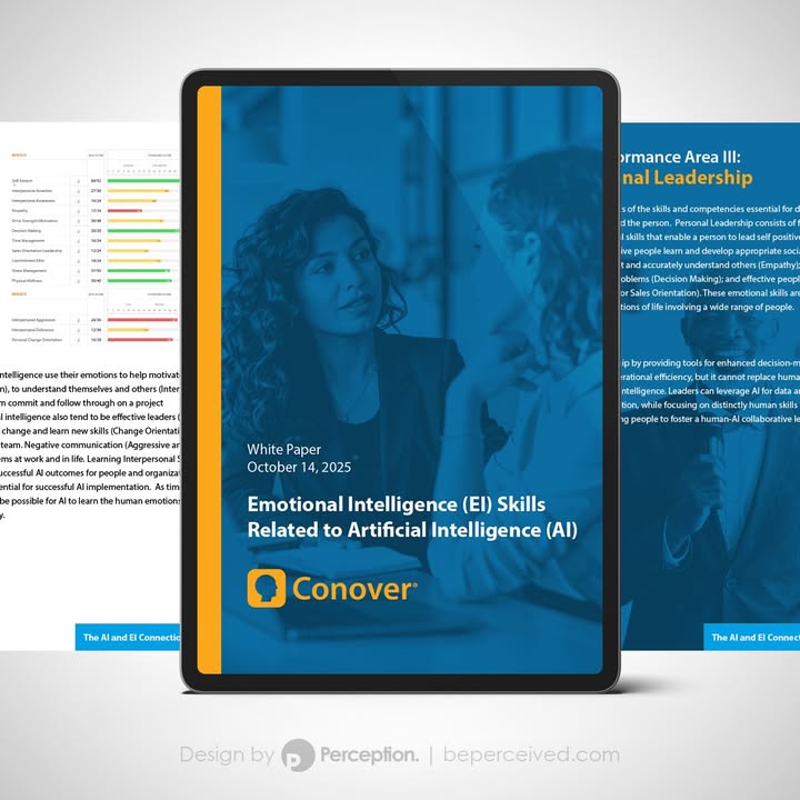
Perception LLC added a new photo — with The Conover Company.
The Conover Company came to Perception LLC with a need to highlight the connection between Emotional Intelligence (EI) Skills and Artificial Intelligence (AI). Though
different, AI and EI are increasingly seen as complementary, and Conover's newly designed white paper offers insight into exactly how, by breaking down the core competencies and related emotional skills.

Perception LLC
With West Bend Area Chamber of Commerce – I just got recognized as one of their top fans! 🎉
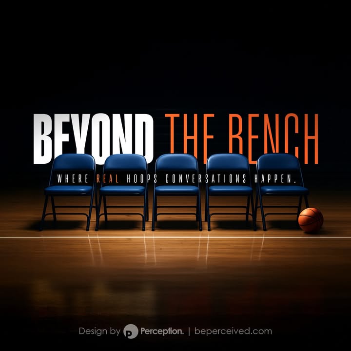
Perception LLC added a new photo.
Graphic for Lee Green's newest basketball podcast, "Beyond the Bench," where real hoops conversations happen.
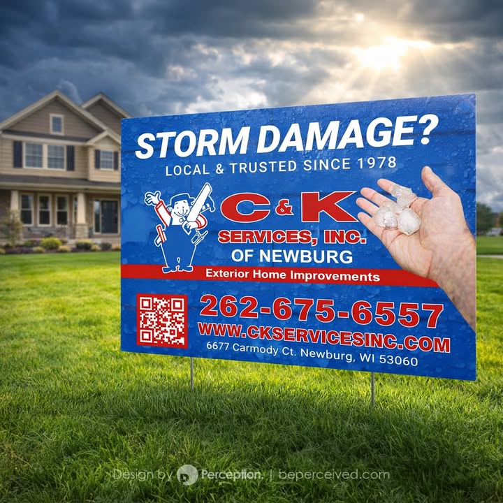
Perception LLC added 2 new photos — with C&K Services, Inc. of Newburg.
C&K Services, Inc. of Newburg was looking to expand their Out-of-Home advertising (OOH) to directly target local residents when storm damage occurs. By leveraging yard signs and door hangers, they prompt neighbors to talk to one another and to think about their own homes after a storm, reinforcing the fact that they've been local and trusted since 1978, and are here to stay.
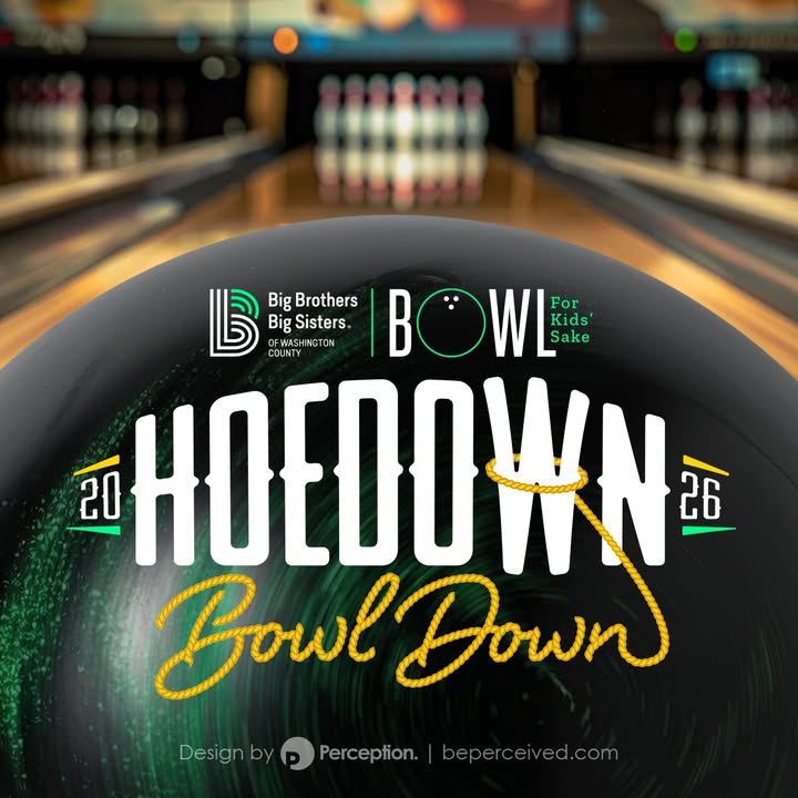
Perception LLC added a new photo — with Big Brothers Big Sisters of Washington County, WI.
Big Brothers Big Sisters of Washington County, WI recently came to Perception LLC in need of a logo and marketing graphics to support their Western-themed 2026 Hoedown Bowl Down fundraiser. Thank you BBBSWC!
Perception LLC
Vortex Pickleball Club worked closely with Perception LLC to create eye-catching visuals leading up to their grand opening. With an existing logo already in place when they first reached out, they were looking to enhance their web and print graphics further; from social media cover photos and business cards, to large format designs and even custom house paddles. Thank you Vortex Pickleball Club for trusting Perception LLC with your graphic design needs!
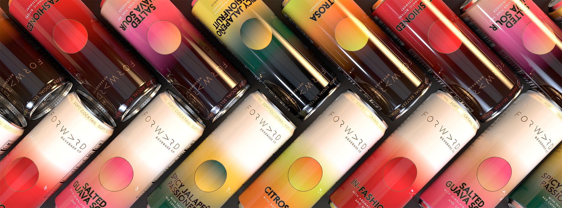
Perception LLC added a new photo — with Forward Beverage Co. .
Amy and Paul at Forward Beverage Co. take great pride in creating extraordinary non-alcoholic beverages that are made with passion and dedication. Perception LLC developed individual 3D renderings of their products to help highlight their 8 unique offerings, and also combined them to create this herringbone pattern. The right-facing arrows are reminiscent of their logo and embody their forward-thinking vision for a market that is only just beginning to take off.
Perception LLC
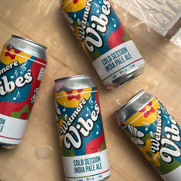
In celebration of the Sun Prairie Summer Concert Series at Wetmore Park, the label design for Wetmore Vibes comes to life with color and borrows design elements from the park itself.
Perception LLC
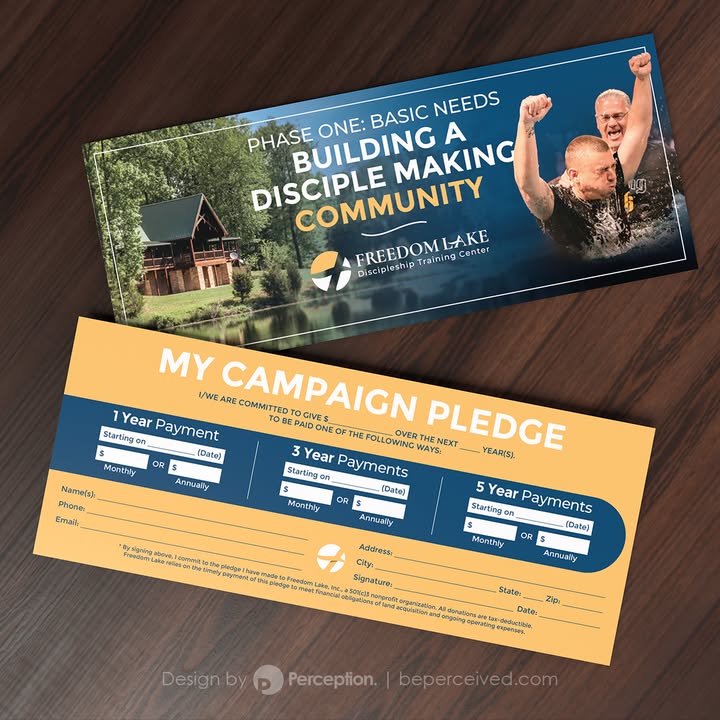
Freedom Lake Ministries is a Christ-centered nonprofit organization dedicated to discipling, equipping, and mobilizing Christian disciple-makers.
They exist to help men be freed from old habits or destructive patterns by becoming Jesus’ disciples who multiply the Kingdom of God. Their campaign to expand and offer more opportunities to those who wish to change their lives included pledge cards, which were designed to easily gather commitments from donors.
Perception LLC
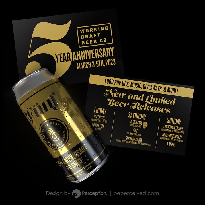
It's pretty amazing going to work each day when you get to design for clients who love what they do and who try to make the world a better place each day. Working Draft Beer Company in Madison, WI is that and more. They're a socially conscious group who love to have fun, create great beer, and give back to their local community. It's an absolute blast designing with them and I couldn't be more excited to wish them a Happy 5 (Fünf) Year Anniversary coming up in a couple of weeks. If you're in town, make sure to stop by and join in the celebration. Congratulations Working Draft Beer Company. You're doing great things!

Perception LLC
Happy Valentine's Day!
Perception LLC added a new photo.
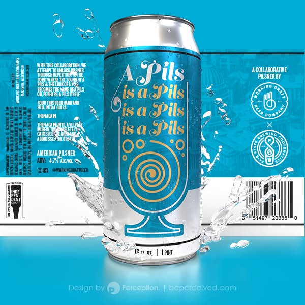
Label design and product rendering for "A Pils is a Pils is a Pils is a Pils," a collaborative beer between Working Draft Beer Company and Fair State Brewing
Perception LLC added a new photo.
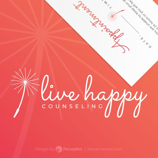
Perception developed the logo and visual branding of Live Happy Counseling with the goal of conveying feelings of ease, weightlessness, and freedom from worry.
The simple design of a dandelion seed, floating softly on the breeze with just a hint of forward momentum, compliments a soft and approachable font. Meanwhile, the color pallet gives a feeling of warmth aimed at a primarily female demographic.
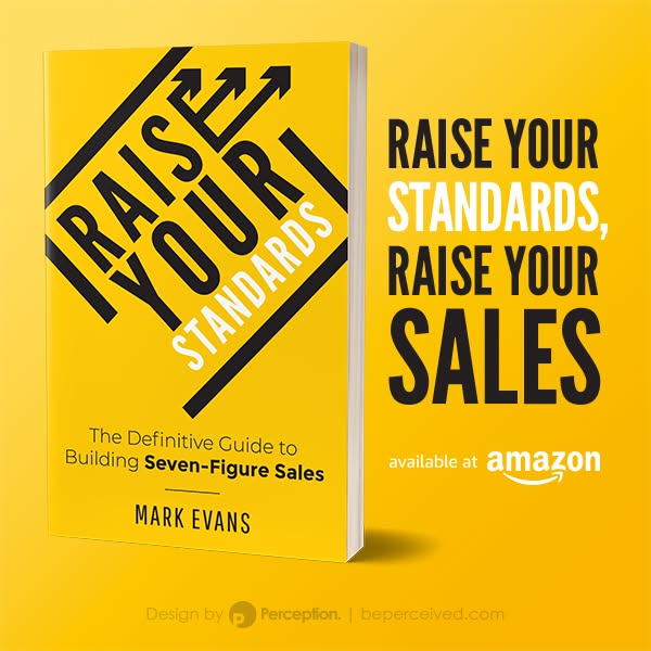
Perception LLC added a new photo — with Mark Evans.
Cover design for Mark Evans' Raise Your Standards. Pick up a copy on Amazon!
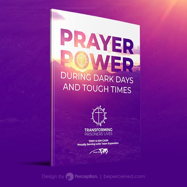
Perception LLC added a new photo — with Tony and Kim Cash.
Proudly serving with Team Expansion, Tony and Kim Cash minister to those in the prison system to inspire prayer, fight recidivism, and stand alongside Christ. The cover art for Prayer Power During Dark Days and Tough Times was designed by Perception to highlight the positive power of prayer through the imagery of a rising sun over a dark and mountainous landscape. Utilizing purple hues consistent with Tony and Kim's existing branding (also developed by Perception), the design utilizes a juxtaposition of the clean lines found in the sans serif type and the jagged edges of rock to create a sense of hope, warmth, and peace.

Perception LLC added a new photo — with Green Bay Tennis Center.
Logo for Green Bay Tennis Center
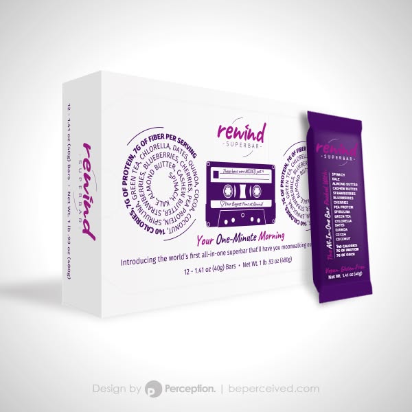
Perception LLC added a new photo — with Rewind and Ryan Lee.
80's inspired packaging for the Rewind Superbar. The entire "boombox" is designed to be fun and fresh, sporting a cassette tape that is customized with each customer's name, speakers listing the ingredients, and even an antenna on top.
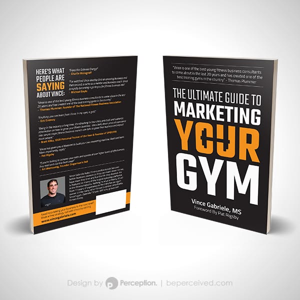
Perception LLC added a new photo — with Vince Gabriele.
This Book Cover for Vince Gabriele's The Ultimate Guide to Marketing Your Gym utilizes simple typography and negative space to create a central dumbbell icon within the word "Your."
Perception LLC
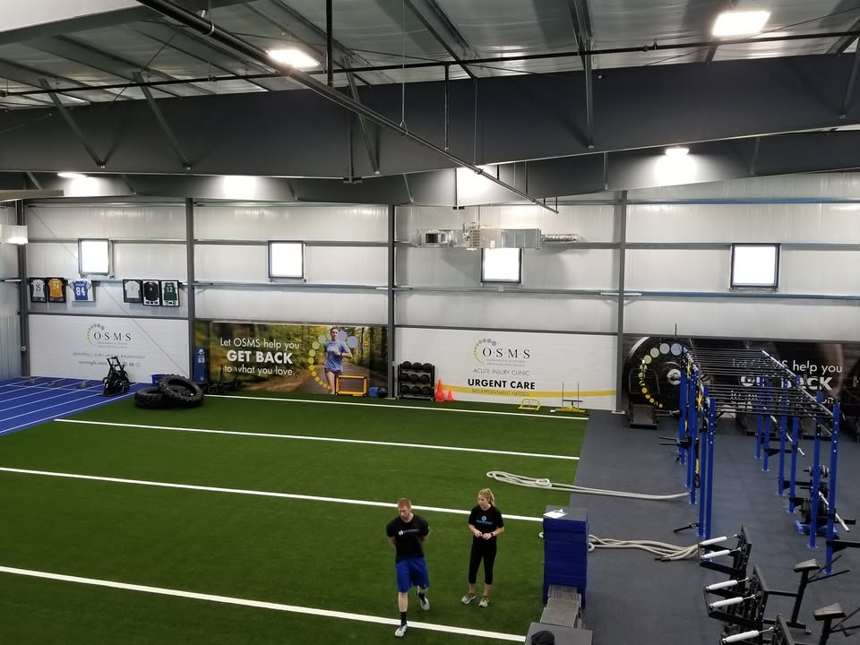
4 large panels create an entire sponsor wall for OSMS at Synergy Sports Performance.
Perception LLC added a new photo.
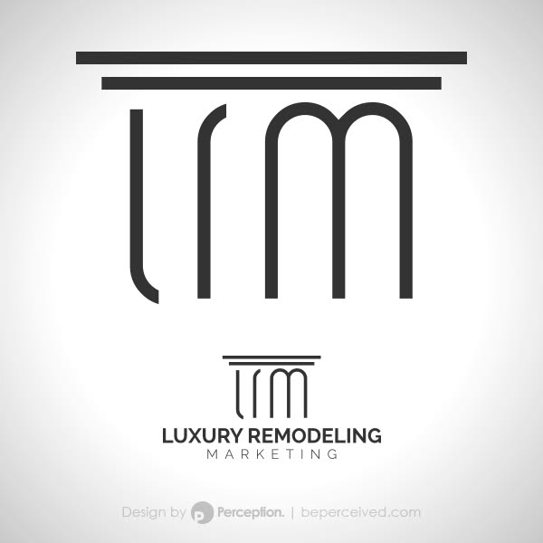
The logo for Luxury Remodeling Marketing was created specifically to highlight the strength and value that this unique service provides to its high-end clients in the remodeling industry. Utilizing the letter forms LRM to create the grooves of a strong Doric Greek column, the logo also takes advantage of fine lines to create equal spacing and balance throughout, appealing to the more classic sense of luxury while maintaining a strong modern aesthetic.
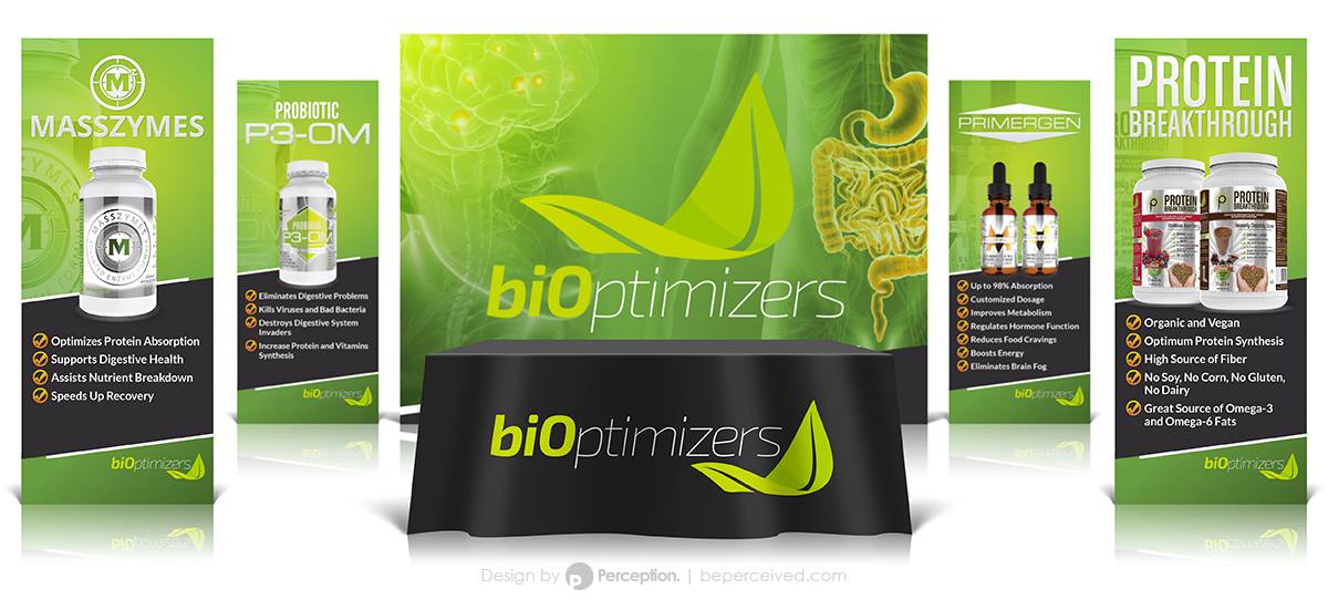
Perception LLC added a new photo — with BIOptimizers.
Tradeshow booth design for biOptimizers.

Perception LLC added a new photo — with The Creamery Downtown and Toast & Company.
A logo we designed for The Creamery.
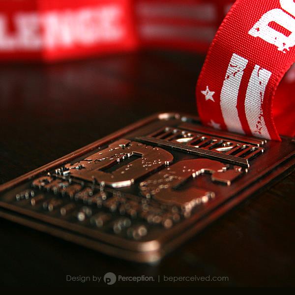
Perception LLC added a new photo.
A medal we designed for finishers of the DC Challenge, an urban adventure race hosted in Washington D.C.

Perception LLC
A new wall graphic for Orthopedic & Sports Medicine Specialists of Green Bay.